Styleguide
Design system 4.0, called Redaction. This page is built from its canon: one file of token values and one document of rules.
Overview
- Rules
- 34: 24 have an automatic check, 6 have one for part of the rule (R-4, R-6, R-7, R-13, R-23 and R-29), 4 are checked by review only (R-9, R-16, R-21 and R-26)
- Do and don’t
- 18 pairs; the Storybook draws each in both modes
- Parts
- 34 parts, 8 marked Trial; Link has no part of its own: it is a base rule
- Colour
- 5 colour sets in 2 modes; media and TV stay dark in both
- Contrast
- 364 pairs measured, each at or above the floor for its use (Lc 30 to 75)
- Type
- 3 faces, 8 rungs on the canvas, body 17px
- Storybook
- Every part in every state
Counted from the canon and the contrast measurements when this page was built.
Rules
Numbered as the canon numbers them; a number is never reused. Where this page and the canon disagree, the canon wins.
Signature and headlines
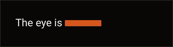
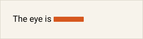
- R-1 The redaction bar is drawn over closed in “The eye is closed.” and nowhere else: not in an H1, a Plate, an entry page, an empty state, a mock or a specimen. The bar stays a signature because it sits on one word in one sentence and nowhere else. pair 1 · ruled
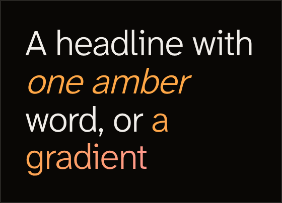
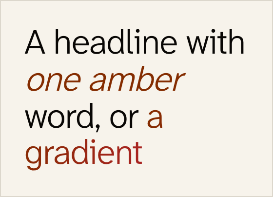
- R-2 Every H1 on every surface is one ink at the context’s display weight: no accent word, no
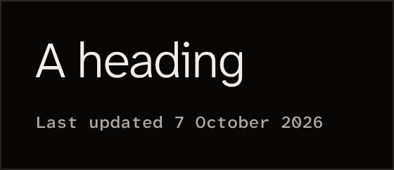
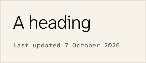
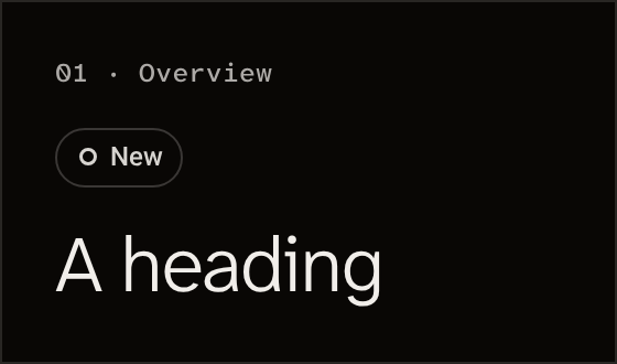
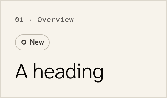
<em>, no second colour, no bar. A headline in one ink is read in one pass; an accent word pulls the eye to itself before the sentence. pair 2 · ruled - R-3 No kicker, eyebrow, pill, badge or numbered label above a heading; a source or date is a meta line after it. The reader comes for the heading, and a label above it is read first while saying less. pair 3 · ruled
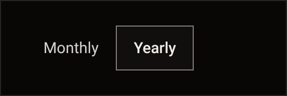
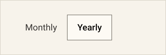
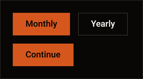
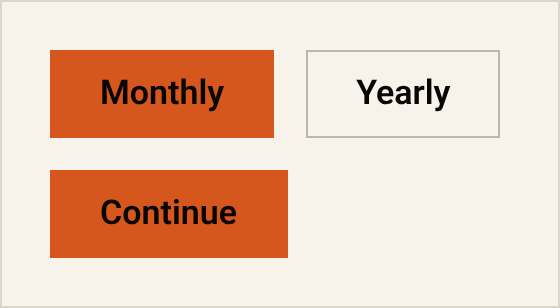
- R-4 One primary fill per page at natural width; a selected tab, row or nav item is text plus a rule, a selected segment is the raised surface tone on a 1px control edge, and no selected state is amber. A fill on a selected item would blur which control is the one to press next. partly by review, pair 10 · changed
Containers and layout
- R-5 No card: a bordered or filled block is only Notice, Field, Sheet, Dialog, Confirm or Plate, and none sits inside another; the one other filled block is the television drawn on
/tour's beat 05. Every edge is something to look past, so the few boxes that remain each mean one thing. pairs 7 and 8 · changed - R-6 No grid of like boxes: never three or more equal containers in a row each with a glyph, a title and a sentence. A row of like boxes asks the reader to compare shapes before reading what is in them. partly by review, pair 7 · changed
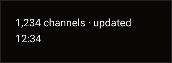
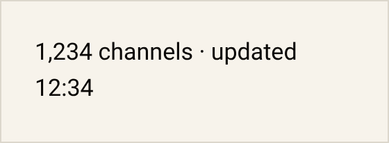
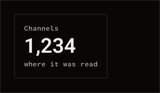
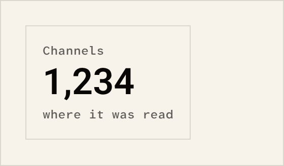
- R-7 No stat tile and no hero number: a number sits inline at body size with its server time, or in a Plate with a source, and a round invented figure never ships. If a number is set large and alone, it looks like a boast with no time or source behind it. partly by review, pair 4 · ruled
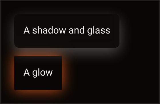
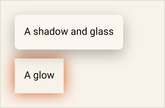
- R-8 Flat on the ground: no shadow, glass, gradient, glow, halo, background pattern, side stripe or hover lift; radius 0 but the bar, the pill and the capsule. A shadow or a glow adds depth to a flat page and draws attention away from the words. pair 9 · ruled
- R-9 Content before controls: at 320 a row’s label shows twelve characters before its controls, or the controls move to the row’s detail. On a small screen the reader needs to know what a row is before what it does. by review only · ruled
- R-10 No carousel, marquee, auto-scroll, strip of customer quotes or wall of logos. Content that moves by itself or waits behind a swipe can be missed, and a strip of quotes or a wall of logos asks to be taken on trust. pair 15 · ruled
Colour
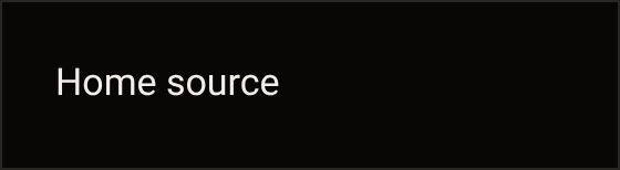
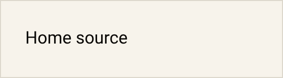
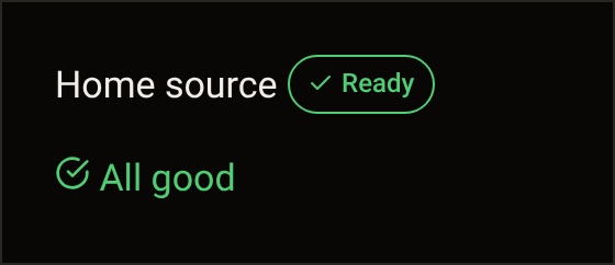
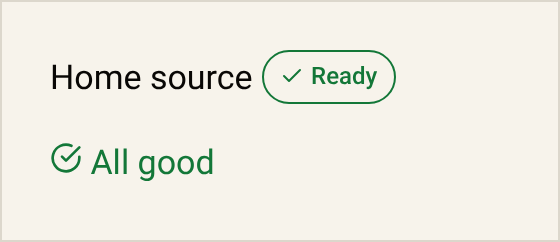
- R-11 No green for a live, ready, ok or up-to-date state anywhere: StatusChip, Plate and Notice lose their live and ok tones, the green role leaves the colour set, and the status palette is warn, alert and neutral. Colour is kept for what needs the reader, so a colour on a working state is noise they learn to skip. pair 5 · ruled
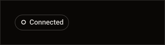
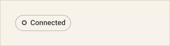
- R-12 No indicator of any colour for a thing that works: a working thing is silent, and a state shows only beside the Button or Link that acts on it. When a working thing says nothing, the reader looks only where there is something to do. pairs 5 and 6 · ruled
- R-13 Colour never travels alone, no percentage or bar is coloured unless an operation is running, and every colour is a semantic token. Some readers cannot tell colours apart, so a colour always comes with a word and marks only what is happening now. partly by review · ruled
- R-14 Body text is
--ink-primaryor--ink-secondary(Lc ≥ 75);--ink-tertiarycarries labels and meta only;--ink-decorativeis never text; grey never sits on a coloured ground. Body text uses the two strongest inks because they carry enough contrast for a long read. pair 11 · ruled
Type and readability
- R-15 Body is 17px, and nothing a user must read sits under 12px on desktop, 14px on touch or 24px on TV, scaled mocks and tour stages included; a device depiction on
/touris a picture and is held by its scale floor instead. Text under these sizes is hard to read, and the TV size is the largest because a TV is read from across the room. pair 11 · changed - R-16 Prose runs at
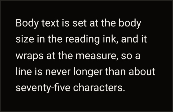
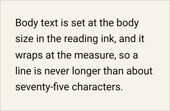
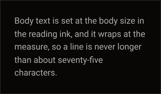
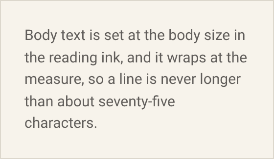
--measureand no line passes 75 characters; a hero sub-line is prose. Past about 75 characters the eye loses its place on the way back to the start of the next line. by review only, pair 11 · ruled - R-17 Sentence case everywhere: no
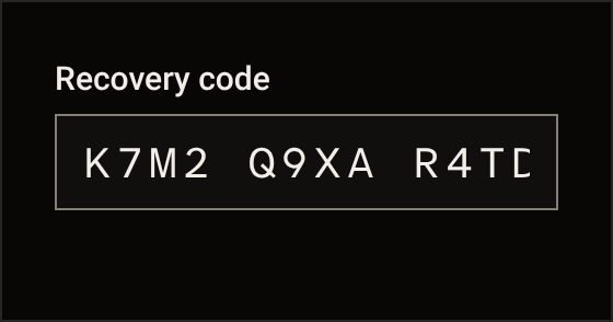
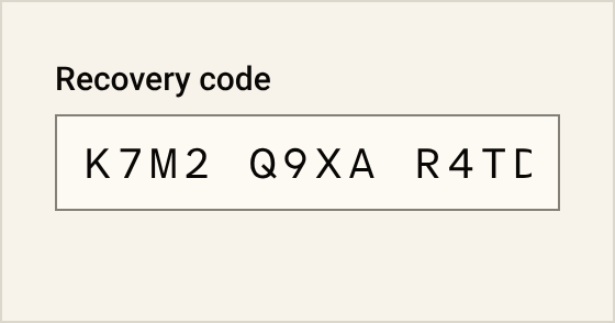
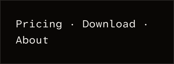
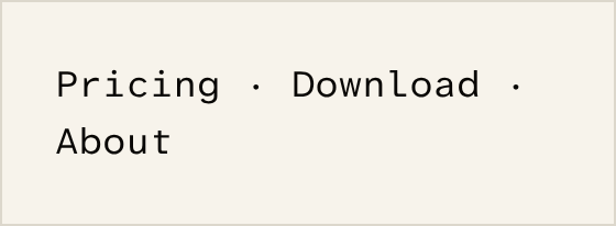
text-transform: uppercase, no all-caps string, and label tracking 0 (the TV label keeps 0.04em). Sentence case reads as words; capitals spaced wide are read letter by letter. pair 12 · changed - R-18 Mono is for what you copy (codes, keys, references, times) and the Plate label; never nav, row values, footers, headings or prose. Mono marks what the reader copies, and anywhere else it makes plain words look like codes. pair 13 · ruled
- R-19 No italic, no bold display, no outlined or gradient text; emphasis in body is upright 600. Italic, outlined and gradient text is harder to read than upright text at a steady weight. pair 2 · ruled
- R-20 Three faces, each in its role, and nothing else: the platform face for running text, Atkinson Hyperlegible Next for headlines and the sign-off, Atkinson Hyperlegible Mono for codes and labels. Each face has one job, and the mono is drawn so that 0 and O, or 1 and l, can be told apart. changed
- R-21 One heading per section and it says the thing: no intro that restates it, no greeting, no formula (“The [X] for [Y]”, “Meet [name]”, “[Verb] your [noun]”, a question outside the ruled FAQ). Headings that say the thing let a reader skim a page by its headings alone. by review only · ruled
Iconography
- R-22 No emoji anywhere and no text glyph as an icon. Emoji and text glyphs are drawn by each device’s own font and look different from one device to the next. pair 14 · ruled
- R-23 Icons come only from the design system’s own glyph set, 16 or 20px in
currentColor, in a row’s leading slot or an IconButton; never tinted, decorative, in a circle or tile, or above a heading. Icons from one drawn set at two sizes match each other, and an icon that only decorates adds nothing. partly by review, pair 14 · changed - R-24 No stock, generated, 3D or isometric illustration; the pictures are the giraffe, the player’s own interface and footage, and on this page the Storybook’s Do and Don’t pairs. A stock or generated picture shows something that is not the product. changed
Status and reassurance
- R-25 The custody sentence appears once per surface in its ruled words; no stacked reassurance, no trust badge, no lock or shield glyph beside a form. A statement made once in its exact words is held to those words, and stacked reassurance around a form makes the reader wonder what is wrong. ruled
- R-26 One Notice visible per screen; the rest collapse to a count row. One notice gets read, and several at once get dismissed together. by review only · ruled
Motion
- R-27 One curve, three durations, the bar draw as the only signature: nothing pulses, blinks, bounces, floats, shimmers or loops, and nothing moves on scroll. Motion that repeats or follows the scroll competes with reading, and can make some readers unwell. pair 15 · ruled
Copy, public and in-product
- R-28 No em-dash and no en-dash pause in any UI string; a sentence ends, or a middle dot joins at most two short segments. A sentence that ends is easier to follow than two halves held together by a dash. pair 17 · ruled
- R-29 No forced contrast, no default triplet, no trailing participle clause. These patterns pad a sentence that a plain statement would say in fewer words. partly by review, pair 17 · ruled
- R-30 No marketing vocabulary: a word that sells the thing in place of saying what it does. The banned words are kept with the checks. Words that sell leave nothing to check. pair 17 · ruled
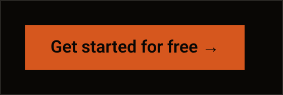
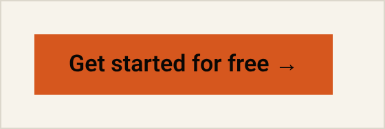
- R-31 A button is the verb and its object (“Add a source”, “Renew”), never “Get started for free”, “Learn more”, “Submit” or “OK”, and carries no arrow or chevron. A label that names the act and its object tells the reader what happens when they press it. pair 16 · ruled
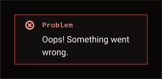
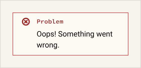
- R-32 No exclamation mark, no greeting, no announced excitement and no cheerful apology; an error names what happened and what the reader can do. Cheerful words get in the way of a reader who wants to know what happened and what to do next. pair 18 · ruled
- R-33 Every state is written in its own words (empty, loading, error, disabled, zero-data), with no placeholder name and no filler text. Every state is something a reader will see, so each one says what is true at that moment. ruled
- R-34 No recurring saying as decoration: a ruled saying appears once, in its one home, and nowhere else; never as a label, strip, footer, meta line, plate source, placeholder or empty state. A line repeated on every page stops being read; said once, where it is explained, it keeps its meaning. changed
Do and don’t
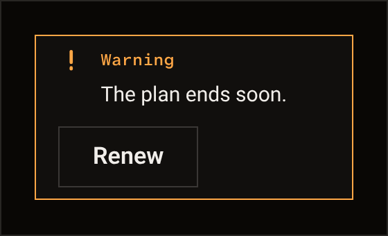
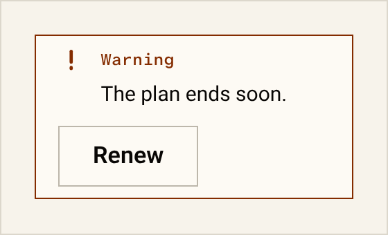
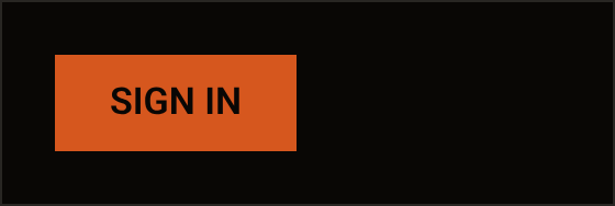
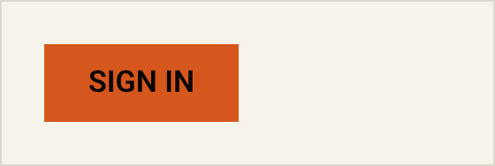
Each pair sets the plain form beside the pattern it replaces. The pictures are the Storybook’s drawings of each side, one in the dark mode and one in the light. The Storybook page draws the same pairs from the parts.
- Sign-off DoThe bar is drawn over closed in “The eye is closed.” and nowhere else. Don’tA bar over a word in a headline hides a word the reader came for.
 R-1
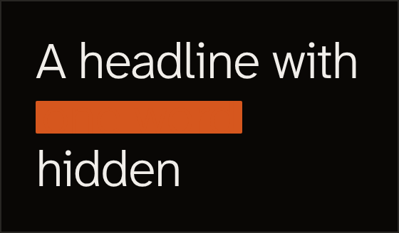
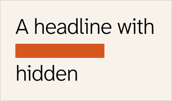
- Headline DoA headline is one ink at the display weight. Don’tAn accent word, an italic or a gradient.
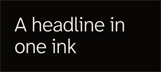
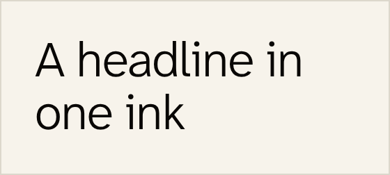 R-2 and R-19
- Above the heading DoA source or a date is a meta line after the heading. Don’tA kicker, a pill or a number above it is a label the reader reads before the words.
 R-3
- A number DoA number sits inline at body size with its time. Don’tA tile with the label on top sets a figure above the sentence it belongs to.
 R-7
- A working state DoA working thing is silent. Don’tA green chip or a check announces what the reader never asked about.
 R-11 and R-12
- A state with a verb DoA state shows beside the Button that acts on it. Don’tA chip with nothing to do is a status for its own sake.
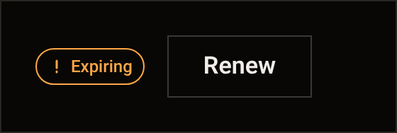
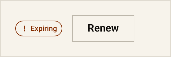 R-12
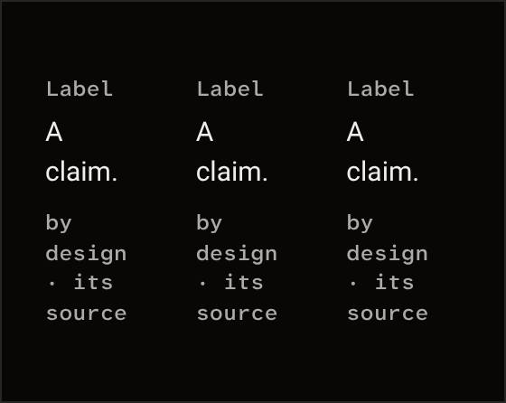
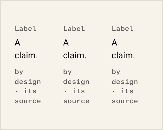
- Claims DoClaims are prose in the measure. Don’tThree like boxes in a row make the reader compare boxes instead of reading.
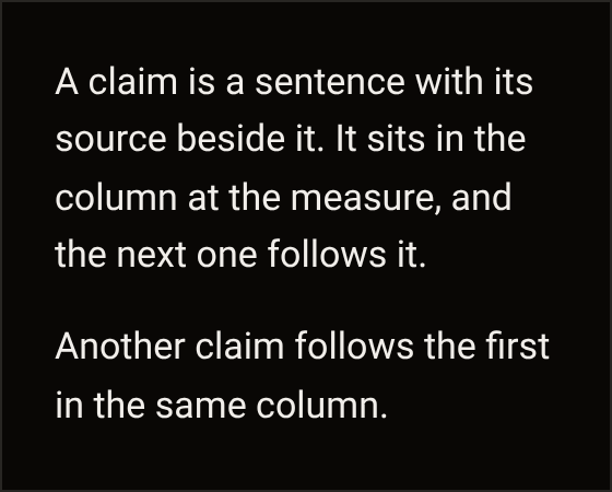
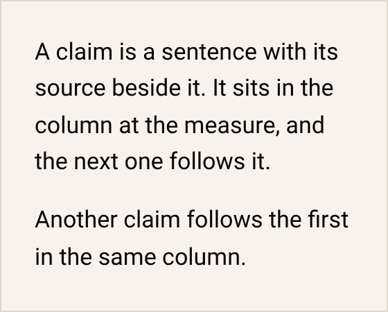 R-5 and R-6
- Containers DoOne Notice with its action. Don’tA box in a box, or a coloured stripe down its side, adds edges and no meaning.
 R-5
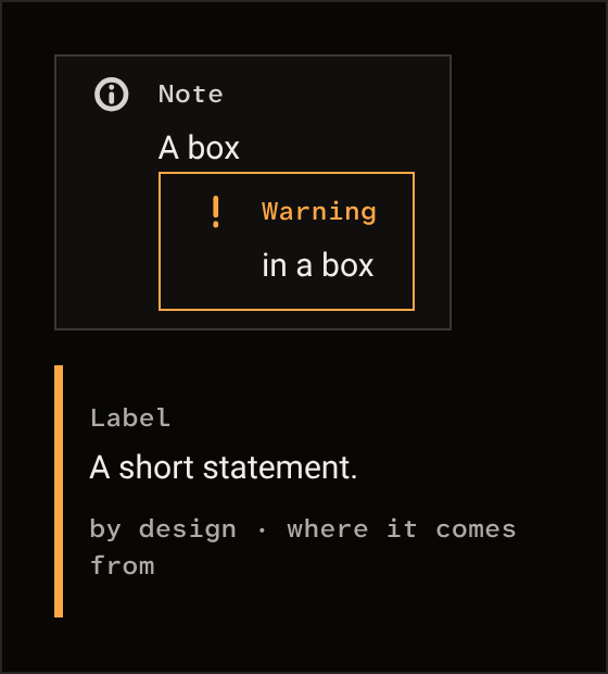
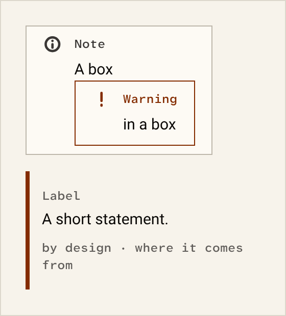
- Ground DoHairlines on the canvas. Don’tA shadow, glass, a glow or a lift on hover moves the eye off the words.
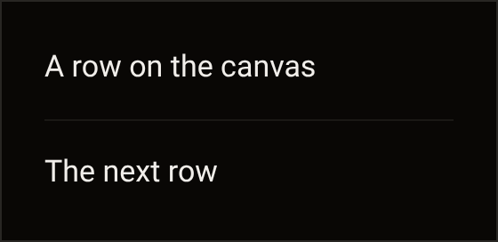
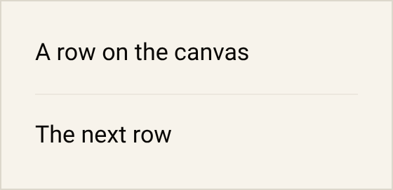 R-8
- Selected DoA selected segment is text plus a rule, and the page keeps one amber fill. Don’tA second one competes with the action.
 R-4
- Body text DoBody text is 17px in the reading ink at the measure. Don’tSmall grey text on a long line is hard to read.
 R-14, R-15 and R-16
- Case DoSentence case, no tracking. Don’tCapitals spaced wide are read letter by letter.
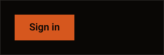
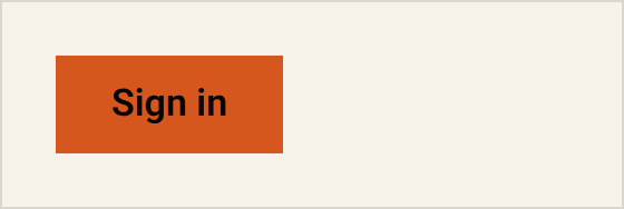 R-17
- Mono DoMono is for what the reader copies: a code, a key, a reference. Don’tA nav label or a footer in mono reads as a code.
 R-18
- Icons DoA 16px glyph in a row’s leading slot. Don’tAn emoji, a glyph in a circle or a tile above a heading decorates and says nothing.
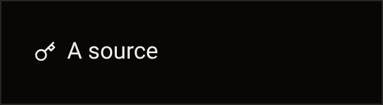
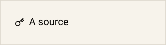 R-22 and R-23
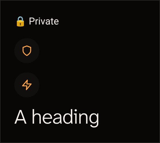
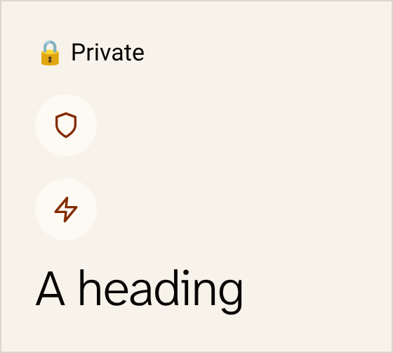
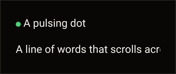
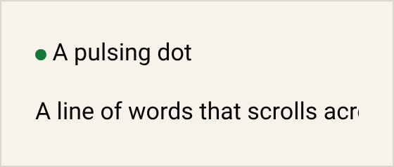
- Motion DoThe bar draws once, then rests. Don’tA pulse, a marquee or a reveal on scroll moves while the reader is reading.R-10 and R-27
- Buttons DoA button is the verb and its object, with no arrow. Don’t“Get started for free” says nothing the reader can act on.
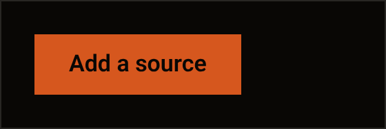
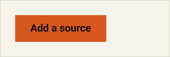 R-31
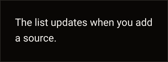
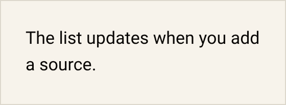
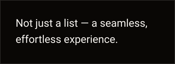
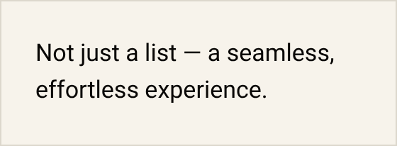
- Sentences DoA sentence ends. Don’tA dash that joins two halves, a “not just” contrast and the marketing vocabulary are the tells of text nobody read twice.
 R-28, R-29 and R-30
- Errors DoAn error names what happened and what the reader can do. Don’tA cheerful apology names neither.
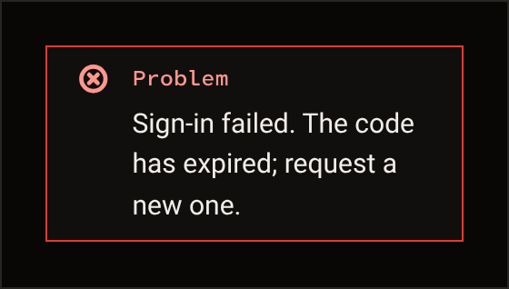
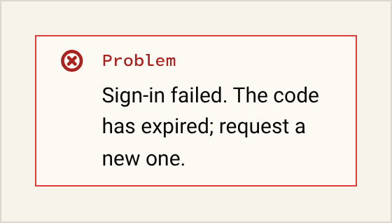 R-32
Foundations
Drawn from the tokens. Every role in every set, with its contrast figures, is in the Storybook’s token pages.
Colour
The canvas roles in the dark and the light mode, each drawn on the ground its contrast was measured on: APCA Lc with the floor for its use, then the WCAG ratio. The light set is the paper one.
surface-page #090705 #f7f3eb surface-raised #110f0d #fdfaf4 surface-sunken #1a1815 #ece7de edge-hairline #1a1815 #ece7de edge-default #282623 #dcd7cc edge-strong #3a3735 #bdb7ab control-edge #83807c Lc 35 (floor 30) · 5.1:1 #848078 Lc 60 (floor 30) · 3.6:1ink-primary #f1eeea Lc 97 (floor 75) · 17.4:1 #090705 Lc 99 (floor 75) · 18.2:1ink-secondary #d7d4d0 Lc 81 (floor 75) · 13.6:1 #3a3735 Lc 90 (floor 75) · 10.7:1ink-tertiary #adaaa7 Lc 56 (floor 55) · 8.7:1 #605d5a Lc 75 (floor 55) · 5.9:1ink-decorative #83807c Lc 35 (floor 30) · 5.1:1 #afaaa3 Lc 39 (floor 30) · 2.1:1ink-on-accent #090705 Lc 37 (floor 30) · 5.0:1 on accent-fill #090705 Lc 37 (floor 30) · 5.0:1 on accent-fillaccent-fill #D6571E Lc 35 (floor 30) · 5.0:1 #D6571E Lc 60 (floor 30) · 3.6:1accent-fill-hover #ffa746 #ffa746 accent-ink #ffa746 Lc 66 (floor 45) · 10.4:1 #842c00 Lc 83 (floor 45) · 8.1:1redact-fill #D6571E Lc 35 (floor 30) · 5.0:1 #D6571E Lc 60 (floor 30) · 3.6:1redact-reveal-fill #ffa746 #ffa746 status-warn #ffa746 Lc 66 (floor 60) · 10.4:1 #842c00 Lc 83 (floor 60) · 8.1:1status-alert-fill #de3c37 Lc 33 (floor 30) · 4.6:1 #de3c37 Lc 62 (floor 30) · 3.9:1status-alert-ink #ff988d Lc 62 (floor 60) · 9.7:1 #a92321 Lc 76 (floor 60) · 6.4:1focus-ring #ffa746 Lc 66 (floor 45) · 10.4:1 #842c00 Lc 83 (floor 45) · 8.1:1selection-bg #ffa746 #ffa746 selection-ink #090705 Lc 67 (floor 60) · 10.4:1 on selection-bg #090705 Lc 67 (floor 60) · 10.4:1 on selection-bgscrim-canvas rgba(9,7,5,0.60) rgba(9,7,5,0.60) Media, dark in both modes
-
surface-page -
surface-raised -
surface-sunken -
surface-video -
edge-hairline -
edge-default -
edge-strong -
control-edge -
ink-primary -
ink-secondary -
ink-tertiary -
ink-decorative -
ink-on-accent -
accent-fill -
accent-fill-hover -
accent-ink -
redact-fill -
redact-reveal-fill -
status-warn -
status-alert-fill -
status-alert-ink -
focus-ring -
scrim-top -
scrim-bottom -
scrim-panel -
capsule -
scrim-modal -
shadow-text
TV, dark in both modes
-
surface-page -
surface-raised -
surface-sunken -
surface-video -
edge-hairline -
edge-default -
edge-strong -
control-edge -
ink-primary -
ink-secondary -
ink-tertiary -
ink-decorative -
ink-on-accent -
accent-fill -
accent-fill-hover -
accent-ink -
redact-fill -
redact-reveal-fill -
status-warn -
status-alert-fill -
status-alert-ink -
focus-ring
Accent
-
surface-page -
ink-primary -
edge-default -
focus-ring
Type
- Aa 0O 1lI The platform face, running text
- Aa 0O 1lI Atkinson Hyperlegible Next, the display and title rungs, public headlines and the sign-off
- Aa 0O 1lI Atkinson Hyperlegible Mono, codes and labels
- Display 48 to 72px, weight 300, leading 1.0; 44px on a phone
- Title 36px, weight 300, leading 1.05; 28px on a phone
- Heading 22px, weight 600, leading 1.25
- Body 17px, weight 400, leading 1.55
- Small 15px, weight 400, leading 1.5
- Label 12px, weight 500, leading 1.4; 14px on touch
- Code 20px, weight 500, leading 1.4
- Tab 14px, weight 500, leading 1.3
Prose is set at the measure, 47ch.
Space and edge
hair4pxtight8pxinset12pxgap16pxstack24pxsection40pxbeat64pxpage96px
- radius 0 everywhere, 1px on the redaction bar
- round: status chips and glyphs over video
Motion
- curve
cubic-bezier(0.32, 0.72, 0, 1)- fast
120ms- base
220ms- slow
480ms- the bar’s draw
480ms
Icons
75 glyphs. In use, each takes the ink of the text beside it.
- alert
- arrow-down
- arrow-left
- arrow-right
- arrow-up
- bell
- book-open
- calendar
- check
- check-circle
- chevron-down
- chevron-left
- chevron-right
- copy
- cpu
- dashboard
- download
- edit
- eye
- eye-off
- fedora
- film
- fingerprint
- football
- globe
- grid
- hash
- help
- hockey
- home
- info
- key
- lineups
- link
- list
- lock
- maximize
- menu
- message-square
- minimize
- minus
- monitor
- more-horizontal
- music
- pause
- pip
- play
- plus
- refresh-cw
- search
- send
- server
- settings
- shield
- sliders
- smile
- snowflake
- sources
- star
- star-outline
- stop
- sunglasses
- tennis
- trophy
- tv
- user
- user-round
- users
- video
- volume-2
- volume-x
- webhook
- x
- zap
Brand and voice
- Readability comes first. Every design rule above removes something that stands between the reader and the words or the picture.
- One idea: the thing that is not there. One device: the redaction bar, the shape of the giraffe’s closed eyes. It is drawn once per view, over the word “closed” in the sign-off, and nowhere else.
- The players are dark, always. Light mode is for the reading pages.
Voice
Four traits: honesty, calibration, care without flattery and coherence.
- No unmeasured numbersA number a reader cannot trace to a source is a claim nobody can check.
- No claim that the source code is publicThe code is private, so a claim that anyone can read it would be untrue.
- No internal repo references in public copyA private file proves nothing to a reader who cannot open it.
- No internal-only routes from public copyInternal pages are working tools, and a visitor sent to one finds nothing written for them.
- Exits are named by number: exit 1, exit 2A name made of a number says nothing about where an exit is or what it runs on.
- No competitor comparisonAnother product’s choices are its own, so twiga’s pages say what twiga built.
- No superlatives without proofBecause one counter-example breaks a superlative, the copy says what twiga does instead.
Terms
- twiga’s exits
- Stream routing infrastructure
- provider login
- A person’s provider credentials
- source
- What a person adds to their account
- playlist
- The M3U field only
- account
- What a person signs in to; “vault” only where the wiki and the verifier explain how it works
- Guide
- The programme guide, in every label; “EPG” only where the wiki explains what it is
- twiga relay
- The server; never “twiga server” or “twiga backend”
- twiga player
- The player’s name in full; never “TwigaPlayer”
Parts
Each opens in the Storybook with its states drawn. A part still being tried is marked Trial.
- Button
- Any action on a page: one primary, the rest quieter.
- Field
- Text or a code that someone types, with its hint and error.
- Select
- A choice from a list too long to show at once.
- Textarea
- Text longer than a line, such as a note or feedback.
- Toggle
- A setting with two values that takes effect as it is flipped.
- Checkbox
- An option that is ticked or not, alone or in a group.
- SegmentedControl
- A choice from a few options that all stay in view.
- IconButton
- An action where a glyph says enough, such as close or copy.
- Divider
- A hairline between groups of content.
- Notice
- A message about this page that comes with something to do.
- Dialog Trial
- A question or form to answer before going on.
- Confirm
- The extra step before an action that cannot be undone.
- Toast
- A short note on a failure, or on something that happened off screen.
- Skeleton
- The shape of content on its way, when the layout is known.
- EmptyState
- A line that says what is missing, with a way on if there is one.
- Sheet
- A panel that rises from the bottom edge to hold a short task.
- ListRow
- One line of a list: a label, a value and its action.
- Disclosure
- Extra detail, kept behind a row until someone opens it.
- ProgressLine
- How much of a task is done, when that is known.
- Keycap Trial
- A key name that hints at a shortcut, shown on hover or focus.
- Monogram Trial
- The tile for a channel in a list, grid or guide.
- NowChip Trial
- The way back to now in the guide.
- Capsule Trial
- A glyph button over the picture, such as play.
- Chip Trial
- A small label on a row: a category, a quality tier or a state.
- Menu Trial
- A short list of choices that opens from a control.
- Slider Trial
- A value set along a line, such as volume.
- PageHead
- The top of a page: a way back, the title and the page actions.
- CopyValue
- A value to copy, such as a code or an address.
- Plate
- One fact, where it comes from and when it was checked.
- Redaction
- The sign-off, with the bar over its last word.
- StatusChip
- A state worth naming: a glyph, a word and a colour together.
- Lockup
- The twiga.tv wordmark, wherever the name stands as a logo.
- Mark
- The giraffe, on a hero and nowhere else.
- Icon
- A glyph that takes the colour of the text around it.
Rulings
Design rulings in plain words, newest first.
29 October 2026
Rules changed: R-5, R-15 and R-24
The TV beat on /tour draws its television: one flat bezel and a centre stand in a neutral ink, with no logo, glow, shadow, reflection, gradient or border. R-5 allows it in that beat and nowhere else.
A mock in a device frame on /tour is a picture of the product, drawn from the player’s own parts on every deploy, never a screenshot. It is laid out at the device’s own size and scaled by one factor into its frame; below a minimum scale, a closer view or a simpler state takes over. R-15 holds it by that minimum scale instead of its type size.
The Do and Don’t pairs on this page are now pictures made from the Storybook, in the dark and the light mode. R-24 allows them here and nowhere else.
25 October 2026
Rules changed: R-4, R-5, R-6, R-17, R-20 and R-23
Every page has the same footer.
The redaction bar has one form, drawn inline over “closed” in the sign-off.
Every part has a one-line use and a stage: trial, stable or retiring. Only a part on trial or being retired shows a label.
Each section of the canon now states its rules as they hold today, and the dated rulings are its history. The readability rules keep their numbers, which are never reused, and each says why it exists, what holds it and where it is drawn. Three rules changed their words to match rulings that already stood: the three faces, the selected segment and the TV label.
The styleguide page draws the foundations: colour with its measured contrast, type, space, shapes, motion and icons. R-5, R-6 and R-23 are lifted for those drawings and nowhere else.
24 October 2026
The styleguide gets a public page of its own, built from the canon: the rules, the Do and Don’t pairs, the foundations, the parts and the design rulings. The Storybook, with every token and part in every state, moves to /storybook.
22 October 2026
Rules changed: R-34
A saying away from its one home is decoration, whatever its words.
An interface string says Guide, not EPG, and calls what a person adds to their account a Source, not a Stream.
A ruled saying appears once, in the one place it is explained, and never as decoration: not as a label, a strip, a footer line, a meta line, a placeholder or an empty state.
The signed-in account area is part of the player: it opens inside the player, dark in every mode, and closing it returns to the channel that was playing.
On a touch screen the 12px label steps up to 14px, the touch floor; with a mouse it stays 12px.
The readability rules on this page are adopted. Their purpose is that nothing stands between the reader and the words or the picture. The Storybook gains its page of Do and Don’t pairs.
The start page drops its strip of claim boxes. A claim it keeps is prose in its list, and its brand moment is its close.
No indicator, green or any other colour, for a thing that works: a working thing is silent. The status colours are warn, alert and neutral, and a state shows only beside the button or link that acts on it.
Every H1 on every surface is one ink at its context’s display weight: no accent word, no emphasis, no second colour, no bar.
The bar belongs to the signature alone: it is drawn over closed in “The eye is closed.” and nowhere else, once per view. Headlines lose their bars, and no reason label is drawn anywhere.
21 October 2026
Three faces, three roles. The platform face sets running text: body, small text, the heading rung, buttons and the signed-in product. Atkinson Hyperlegible Next sets the display and title rungs, the headlines of public pages and the sign-off. Atkinson Hyperlegible Mono sets codes and labels, where 0 and O, or 1, l and I, must never be confused.
16 October 2026
The on state of a toggle or a checkbox is the amber fill, and the knob’s position and the tick carry the state too.
15 October 2026
The reading measure is 47ch, which keeps the measured lines of prose under 75 characters. The layers stack base, sticky, overlay, modal and toast, from 0 to 40.
One confirm pattern: the first tap arms it, the word in the alert colour with a 1px alert border; a second tap within 4 seconds acts, and otherwise it disarms. A typed confirm shows the word to type above a code field, and its button waits until the word matches.
The parts list adds IconButton, PageHead, CopyValue and Disclosure, and Menu, Slider and Chip for the player. Label and Prose are utilities, not parts, and a link is a base rule, not a part. No Tag, no Steps and no new tones. Every interactive part declares its hover, focus, disabled, loading, error and empty states, or says why it has none.
No dimming layer behind a sheet: the sheet is opaque with a 1px top rule. Outside the player the one scrim sits behind Dialog and Confirm, where focus is held. A popover or modal in the player has no shadow: an opaque raised surface with a 1px edge.
No kicker above a heading: a source or a date is a meta line after it. Web labels are 12px at 500 with no letter-spacing. At phone width the display headline is 44px and the title 28px; at 1440 the display headline is 72px. No italic anywhere, prose included: emphasis is upright 600. Prose leaves more space above a heading than below it.
Amber is a fill in every context, paper included, and never a text colour: amber words use the accent ink. Each context sets its own colour scheme, caret and selection. A tone always comes with a word that names the state, so colour never travels alone.
Every surface has one mode, and the mode says what outranks expression. Persuade (the start page, the tour, pricing, download, the share cards): the one action, the brand moment, the truth of every claim. Read (the wiki, the journal, the info pages): measure, rhythm, hierarchy. Operate (onboarding, checkout, the account pages): scanability, consistency, states, density, the keyboard. Experience (the players): the picture, with the chrome out of its way.
10 October 2026
The phone tab label has its own step: 14px at weight 500 in the platform face.
2 October 2026
The sign-off is the first line of the footer on every public page, except where the page’s own close already carries it.
The tour alone may frame its pictures in a photographed device, with no drawn chrome and no glow.
No drawn device chrome and no glow anywhere: no drawn browser bar, window dots, address pill, status bar, notch or bezel around a picture of the player, and no bloom, glare or shadow around it.
The reading measure is set in measured characters, not the raw ch unit, because a zero is wider than the average letter: prose stops at about 75 characters a line at 17px.
Selected text takes the revealed word’s pair, so a selection meets the contrast floor too.
A revealed word sits on a lighter amber fill of its own, at the contrast a single word needs, and keeps its weight, so it keeps its width.
A link in running text is the reading ink with a 1px amber underline, so the underline, not the colour alone, marks it. The standalone text link keeps the amber ink, at weight 600 only.
26 September 2026
The signature shows once per view: a page whose own close carries it drops it from the footer. Every bar that hides a word reveals it the same way, on hover, keyboard focus or a tap that holds it, as a colour swap with no motion and no tooltip.
25 September 2026
There is no live chip anywhere. The player’s bar shows the picture quality only.
No caption led by a dash and no arrow on a button: the label is the verb. One primary fill per page, the quiet button second, a text link third.
Every picture of the player on a public page is built from the player’s own parts over footage, never a screenshot or a drawn copy.
The players are dark for good: the web player, its phone layout and the TV app draw only the dark set, and light mode does not reach them.
Nav links are sentence case in the platform face at the small size, never mono capitals. Sign in is an underlined link with a 44px target, not a button, and the page’s one primary action stays in the page.
The sign-off, with the bar over closed, is the signature of the whole site.
The giraffe shows on the start page at desktop widths only, top-aligned with the headline so its closed eyes sit at headline height. On a phone, the start page shows it only in the first-visit veil.
The parts list grows: Notice, SegmentedControl (44px at the least), Select, Textarea, ListRow, Skeleton, Icon, Dialog, Confirm and Toast. Nav, Footer and Row stay with each app. Button has no destructive variant: a destructive action is a quiet button with alert words, a 1px alert border and the arm or the typed confirm.
The touch sheet moves in 220ms, not 350ms, and the panel in 120ms, not 140ms. On TV the guide scroll and the surf strip slide do not animate.
On TV, a size in px at 1080p is half that in sp on the 960dp canvas, so 28px is 14sp.
Codes people have already saved keep the grouping they were saved in; the type they are set in changes.
The player takes the same warm neutral family as the site; the earlier cool cast is dropped. The accent context keeps its four roles only: no part sits on an accent ground.
Light mode stays for reading pages. Media and TV, the player’s contexts, stay dark in every mode. With no stored choice the site is dark, and auto follows the system setting.
Design system 4.0, Redaction, is adopted to replace the earlier system everywhere.